Tuesday, 26 July 2011

My final logo design

My logo design: This was my final logo design which fits in with both the branding and wayfinding elements as the essentials of both are to define something in an image. Here I have shown the logo up in a place in the corridor, and I have shown my chosen colours and designs for it. I really liked my final logo design as I feel it encompassed the school without being too obvious or crude. I think that it is an honest image which utilizes colours and shape very well. I liked my use of line and tone to create someone which was simple whilst being well structured. If I had to do this exercise again I would instead use different colours and maybe add a logo and fonts.

My designs:


This is my design for the interior of the foyer which we were asked to design, as seen on the Aedas presentation. I used the murals around Brixton to create the ideas for it, and I used the flower desins I had found on the internet to create specific sections. I think that the representes the skills I have learnt during the project as, as I was creating it I tried to be aware of the range of people who would be viewing it and the ways it might detract from the surrounding environment. I drew heavily from the styles of Axel Peermoller and Ikea designers like Camilla Diedrich to create this piece. I used them both as they both create interesting, visually pleasing artworks which do not detract from the surrounding environment. I really tried hard to create something which was beautiful whilst being hip and inviting. Like Axel, I used bold insinuating imagery to create this piece, and I told from designers from Ikea by using bold lines and colours. I really liked this outcome as it merges all aspects I liked about brand, but if I could do it again I would probably spend more time defining my colours.

Developing my artistic style: Branding

I wanted to concentrate on one of my interests; I loved the illustration style combined with the bulky style of Aedas. Here was a trial I did. I wanted to use the feel and purpose of the building to make my art, and I used the space around the door to do this; as people came in, I wanted them to be hit by the feel of the school and understand what would be available to them.


I liked this image, and I wanted to keep it black and white because I thought that having a colourful picture under someones feel would make them feel offset as well as though they were disturbing artwork. I think that this shows evidence of me being aware of proportions and purpose of certain parts of a building.

My wayfinding

These were my final designs for wayfinding: I really loved the work of Axel Peemoeller. He uses plain, obvious designs which challenge the viewer's sense of humour. I tried to do this with my desings:


I was satisified with my images as they draw from a strong artist inspiration and match the requests of the students, from their answers. I wanted something which encompassed the creative nature of art, but which would appeal to those who did not have an artistic background. If I had to do this exercise again I would try using colour, although I realy wanted the pictures themselves to look like sketches on the wall as this would contrast to the tradition of wayfinding as bold, distinguishable images.

Wayfinding


I would really like to do something like this when creating my own wayfinding but I would worry that people might take it as a slight on their intelligence. I think that it would be really nice to incorperate a sense of art in the wayfinding, for example if we did end up having flower images on the walls to somehow have this in the wayfinding.
I also wanted to think about ways this could appeal to boys, and Banksy sprang to mind. I think that we could use his urban style in wayfinding, to make it seem less aimed at girls, and also to give a youthful feeling to the school.

Wayfinding

Wayfinding
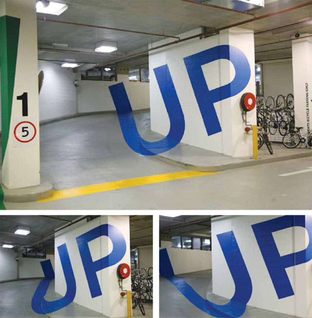
Wayfinding is important as it is a seminal part of our project. Due to the nature of the school, it may be necessary to create methods of wayfinding that are different form the traditional methods. I really like these examples:
I think that they are so blatantly obvious that they evoke a sense of humour whilst being stylish.


More powerpoint stills

More powerpoint stills

More powerpoint stills

Aedas presentation and powerpoint stills

Aedas: what will I show them?
After studying their work closely I decided that the materials they were most likely to be impressed by were glass and metal. They seem to prefer bold abstract shapes to intricate detail, but I find it hard to work with those, so I will pitch my more intricate ideas to them. I think that the BRIT school’s main intention is to create an inviting space, and the robotic structures of Aedas’ portfolio will contrast with this. I also want them to like my ideas, so I will try not to detract from their style too much.
I really wanted my designs to incorporate the sense of life and energy at BRIT whilst appealing to both staff and students. I also wanted to show Aedas my final designs, so I tried to make sure I had these ready. I really like the mural styles of some of throw up artist from Southbank and Brixton, and I have included pictures of these to show Aedas what I mean.


Here are some stills from my powerpoint. Unfortuantly, our teacher was ill on the day we were meant to show Aedas our work, but here are some examples of what my powerpoint looked like:

More inspirations...


This last image may seem at odds with the others but I wanted to include it as I have a love for Spanish architecture, and I find the colours very intimate and welcoming. Although many of the people in my study for bold colours, I really think that if we are trying to create a warm feeling we should resort to pastel tones. Spain is renowned for its welcoming atmosphere, especially to those who have not been there before, and I think that it really has something to do with the warn, sunkissed feel of its architecture.

More inspirations...


I really liked the plain walls in this image and the way they indicate a certain place in the room. I think that I might use this in my final design as it is a good way of wayfinding through the use of colour. I like the way the wall is comforting rather than being oppressive and I like the way it is painted in a jagged outline. I think that I will definitely bear this technique in mind as it is reminiscent of childhood while being bold and inviting at the same time.
I wanted to think about the way fixtures in the room will affect the rest of it and how we could work with this: some of the people in my questionnaire expressed an interest in curved lines when making the new reception, as they said that they really liked the shape of the newest building. I think that if we did go for a curved theme when branding, it would be important to make furniture which would incorporate this, which could then affect our wayfinding. For example, if we had a curved edge, we could work with loopy, curved writing and maybe something similar in the logo.

More inspirations...more patterns

When exploring the themes of pattern and blank wall I came across a way to combine the two: having larger, less detailed patterns engulfing a space. This way they become more like structures themselves than detailed things that might detract from the environment around them. I really like the way the flowers seem to be creeping up the wall: it gives a sense of realism to some obviously unreal.

More inspirations...


When it comes to pattern I generally opt out, finding it easier to work with plain walls. I do however accept that many of the students would really like to have some pattern in their building, and I really like Ikea’s minimalistic approach. When I looked at other people in the class’ work, I found that a running theme was that of nature and trees, and while I find that a bit tacky I did really like the idea of a stylish alternative: Here we can incorporate something which appeals to teenagers without being too arty. I would worry that if people from other strands say nature scenes they might not like them, but I think that if we had something like this it wouldn’t be as discriminate.

More inspirations...


I looked at a variety of pictures of corridors to gain a sense of what makes a professional one, and I really liked this image. Although it is windowless, this place has a sense of sunlight, owing to the bright colours and light fixtures placed at every door. I really liked the colour, and if we use white for the colour scheme it will be easy to co-ordinate lights to go with this. Corridors are hard because they are generally boring due to their structure and content, but I think that at BRIT we could really use it as an opportunity to turn it into a welcoming space.

More inspirations...


This image was an inspiration to me because of the way it incorporates the entire length of the structure, not just segments which may not accurately illuminate. Of course, it may be that this is the case for this building, but I think that generally it would allow for much more light than just normally systematically placed windows. I also think that this would add to the grown up feel that the students wanted when I asked them what they liked in the school. Higher windows add a sophisticated sense, and owing to the length of the building I think we could incorporate this.

Inspirational Images


I love this image, as I have been having to bear in mind that we may not have that much money to spend on things like coloured lights and glass. This is a really good way to make use of natural light and ways it casts shadows, and one of my ideas was to have the brit logo cut into a wall to project a shadow and light onto a wall. I love the way the images really make use of the ways light can dance and move, and especially in this picture it transforms the original place into a majestic dome.

BRIT logo

Re-design of the Brit School logo.
I spent some time thinking about what the logo communicates to me as an individual, and I found that in general I disliked it because:
It is ubiquitous enough to be non-descript rather than familiar. I think that it doesn’t really say much about our school as a whole, apart from the fact that it is a humane place(?).
I also think that it represents dance rather than any other strand because of the movement, without including any of the academic, creative or community features of the school.
I also think that the colour scheme could be more inclusive of all the tones etc.
I think that what the logo does do well is create an exciting feel, and I wanted to keep this.
Some ideas of things I came up with for the new logo was:
A different type of image: for example more than one figure engaged in some activity
Something that represents what BRIT does outside of teach, for example enable to go onto different futures
An image that communicates a different side of BRIT, for example someone literally reaching for the stars.


I did, however, think that this was a bit too similar to the original one, so I tried changing the abstract nature of the shapes to a different one which had more semblance to a trendy image. I used the picture below, by Kao Katrelli, a graphic designer, to inspire my final logo design:


I really liked this logo because I feel it encompasses a sense of what the BRIT school really does: help people achieve their dreams. I think that this logo does it in a non-cheesy way, responding to the information from my questionnaies, which helps me develop the ways i resepond to clients and students.

Questionnaire about the school buildings

Questionnaire about buildings
Which is your favourite of the four buildings:
Reception area, Dance and drama block(orange roof), Selhurst or the Art Block
Reception area -7 votes
Dance and drama block – 3 votes
Selhurst- 5 votes
Art block – 1 vote
From conducting this part of the survey, I deduced that the reception area(apart from beinf the generally most popular area) appealed to people most, and when pressed the most frequent answer was because of its clean, spacious, clear feel. I asked people why they disliked the Dance and Drama block and they said that it was because
1)strands were misrepresented
2)it was unattractive
3)it made us feel childish
This Gave me ideas for my own final piece: I must be aware that people don’t like strand oriented branding or wayfinding, they want something that is attractive to them(see previous questionnaire) and they want a grown up feel.

Brit school buildings

Other buildings around the school: I had a look at some of the architecture around BRIT to get a general feeling about how they might relate to the new building and what it will look like. At the moment, due to changes in funding and time, BRIT is made up of a few buildings which all contrast with each other.


The newest building we met with controversial views: although the design was interesting, many students felt that it misrepresented us as students. As you can see, they decided that they best way to represent the school was to use orange, probably because this is included in our logo. The designers of the building tried to incorporate a more modernistic feel when creating this space: the curve and general shape are mixed with modern materials like iron and plastic, and the blue is incorporated in the gravel. Although it certainly follows the trend of modern architecture, I don’t think the designers really thought about ways in which it would relate to the rest of the school, as the three other buildings are more subtle.


The reception building is the second most modern structure, and combines a mixture of traditional building with a more modern theme. The building incorporates a lot of glass and this allows for light, and for it to look attractive at night. There is a lot of metal going on here, and this gives a kind of working professional atmosphere while making the students feel that they are in a controlled, grown up place. Criticisms of the building have been that it is quite austere, and that the metal appendages on the front make it look like a bit of a crashed space ship.


The third building is the oldest, and is there place were academic lessons take place. It was previously Selhurst Boy’s school, and was built before the war. It Is a traditional red brick structure, with large windows and a tiled roof. I think that this building communicates much more of a school sense, as it is a kind of ‘schoolhouse’ vibe to it, but it looks a bit out of place when looked at next to the more modern fixtures of the reception and drama block.